From naming to identity, an ice cream brand built to be loud, fresh, and unapologetically minimal.
Chillón Ice Cream
2025.
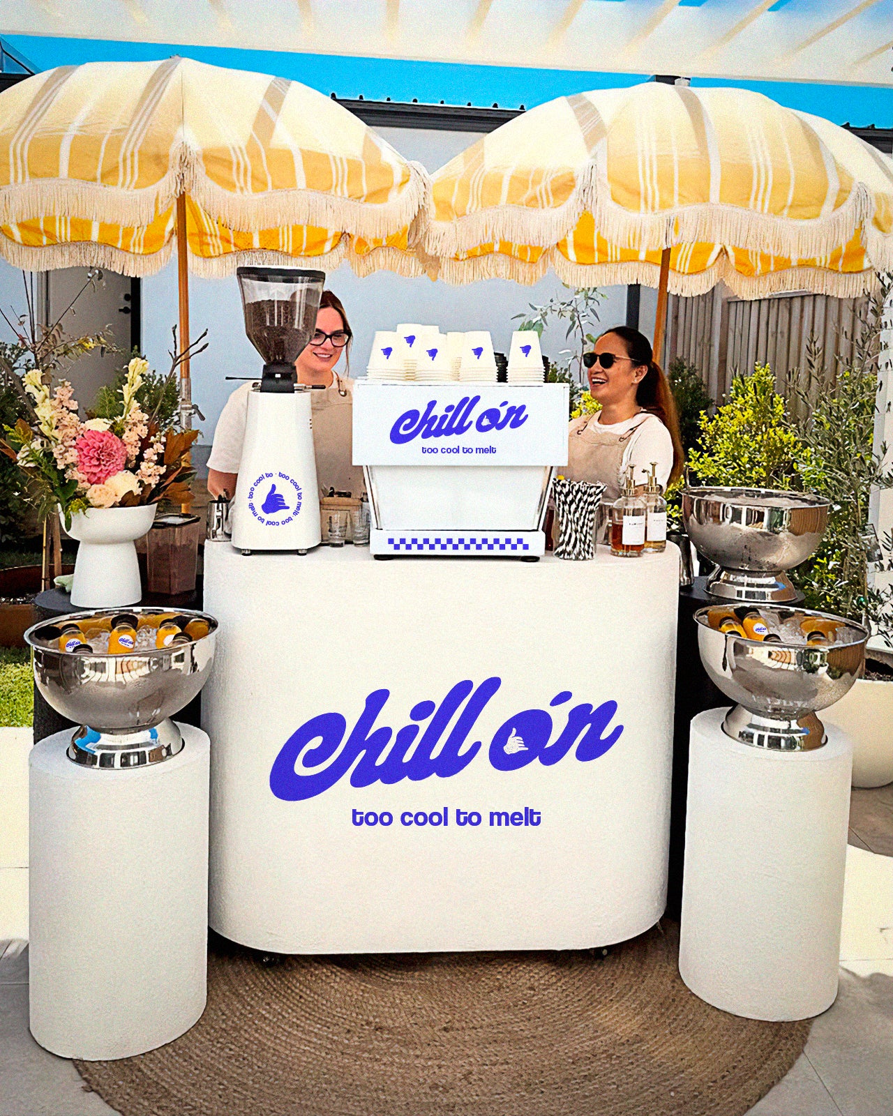
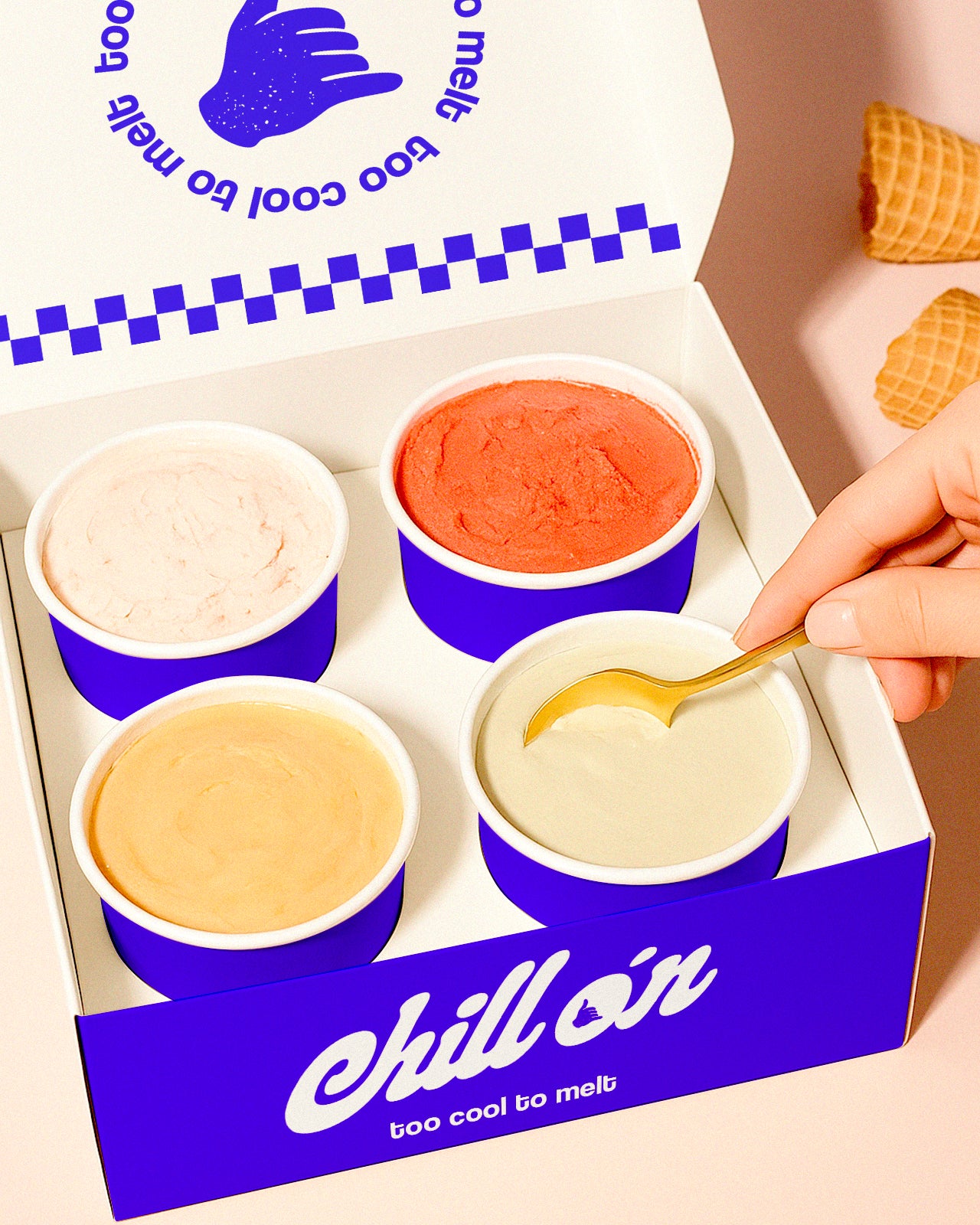
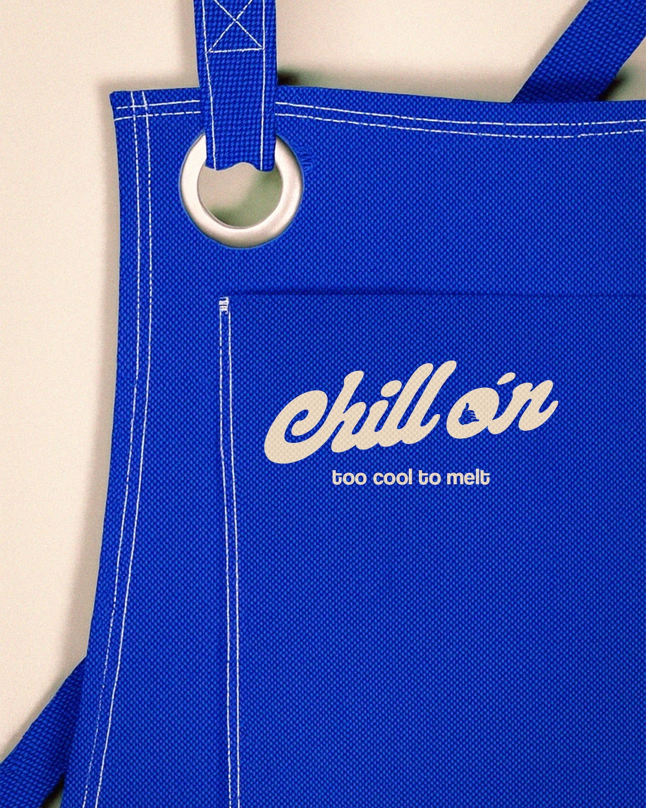
Brand strategy & positioning – Logo & visual identity system - Naming – Tone of voice & messaging guidelines – Branded assets for web, social & print.
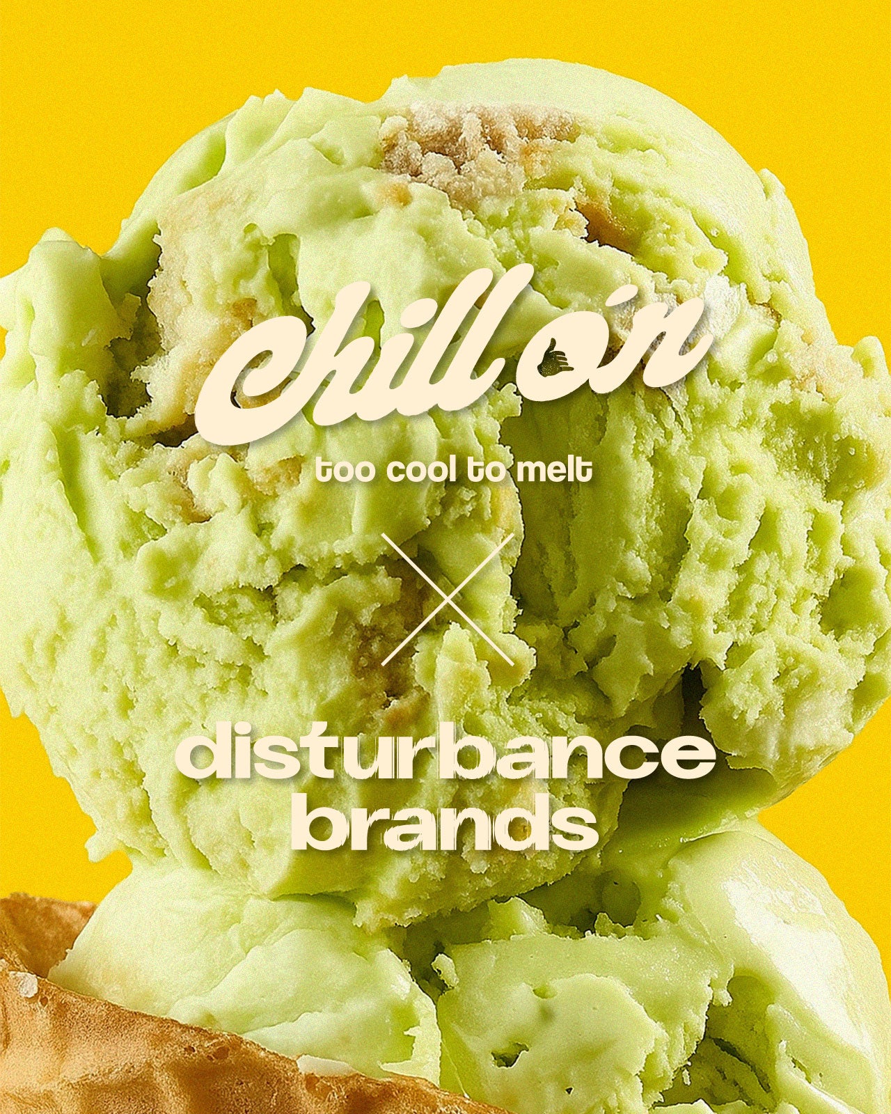
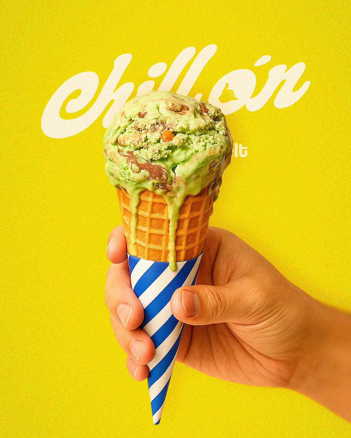
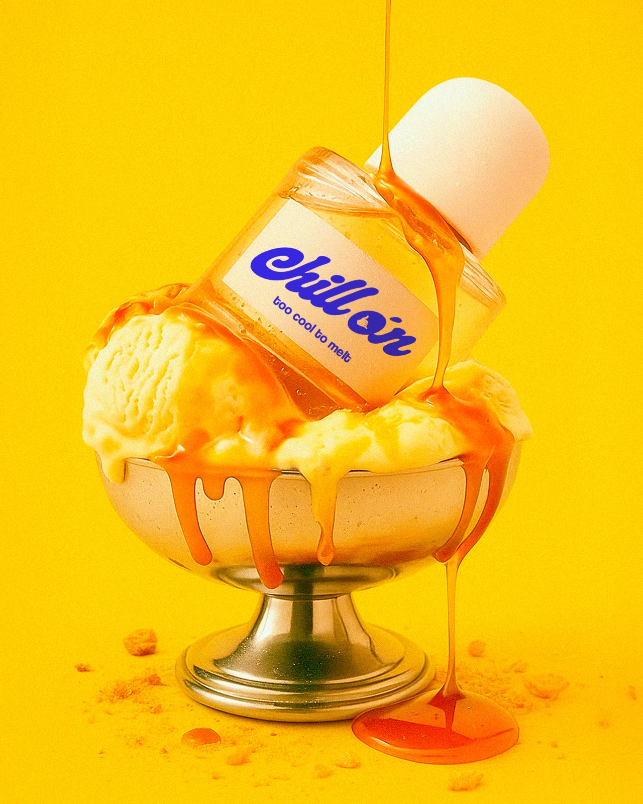
we created Chillón, a Miami-based ice cream brand that turns minimalism into attitude.
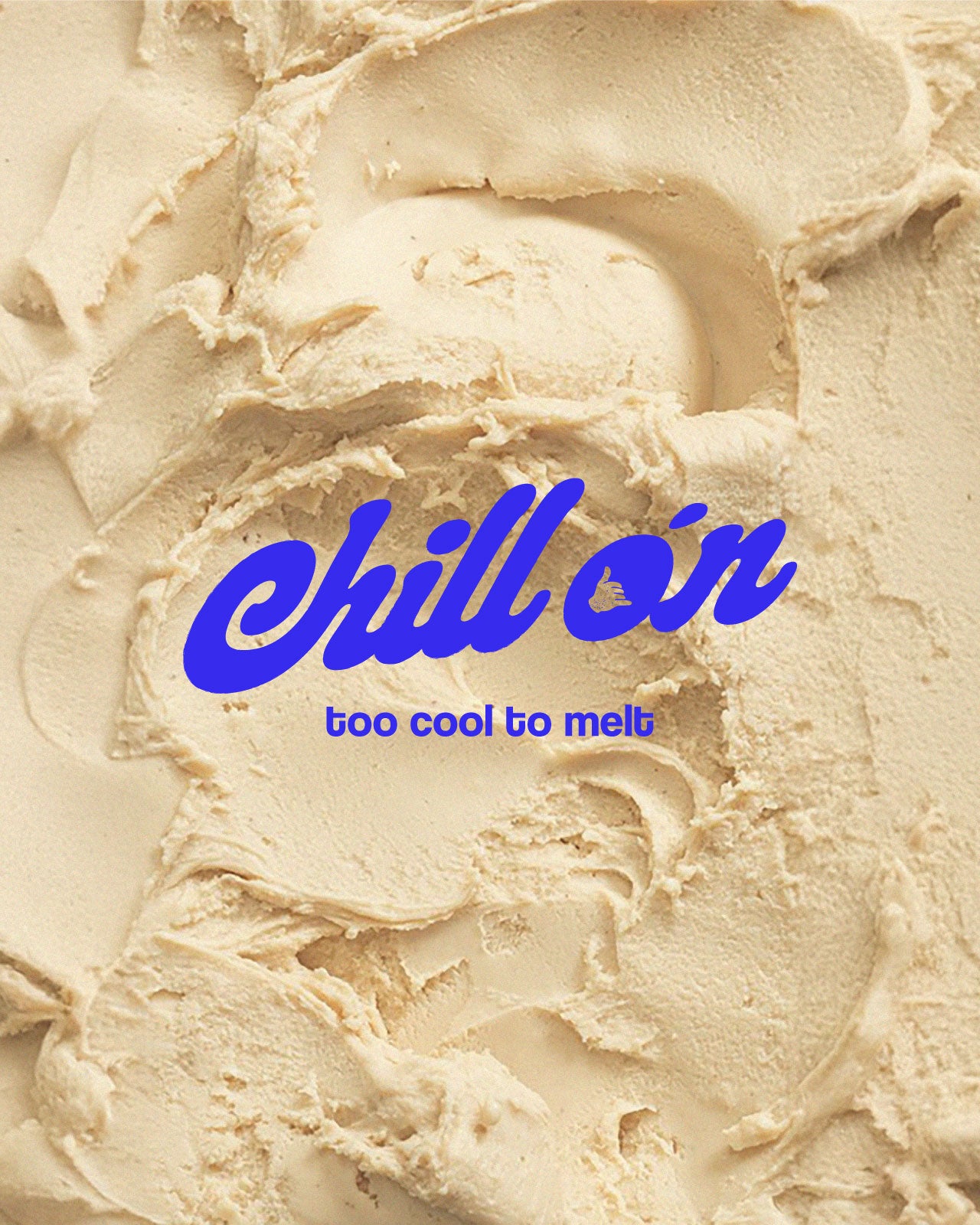
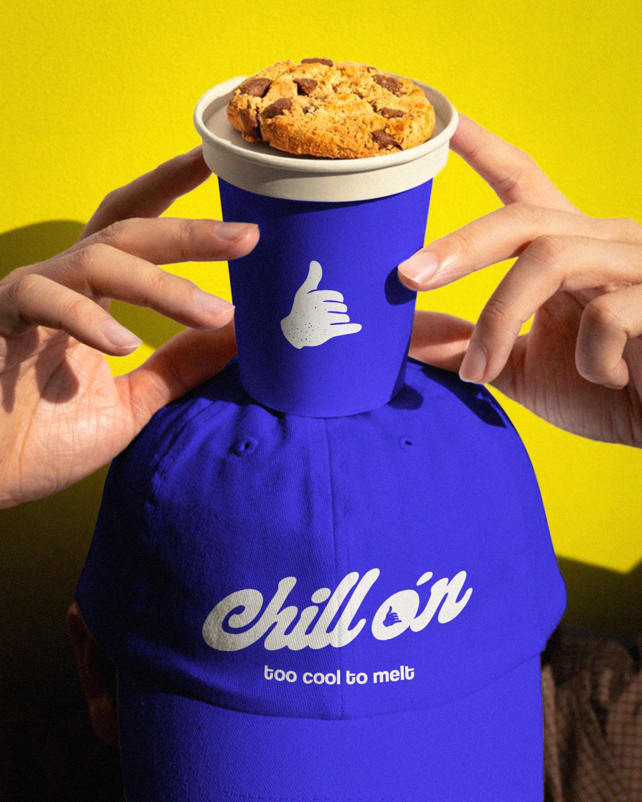
The name itself carries the concept: in Spanish, “Chillón” means loud, exaggerated, expressive — a playful contrast to the cool simplicity of the word “Chill”. Together, they capture the dual essence of the brand: freshness with attitude.
The identity combines clean typography, a vibrant color palette, and a direct tone of voice. No clichés, no excess — just ice cream that makes noise in a market full of quiet brands.
The Result:
Chillón is a brand that doesn’t whisper freshness.
It screams it.
Your cart is currently empty.